



Grey has become a cornerstone of modern interior design, lauded for its incredible versatility, sophistication, and ability to serve as a chic backdrop for virtually any style. Far from being dull, the spectrum of grey offers a nuanced palette ranging from crisp, cool tones to inviting, warm hues, each capable of transforming a living room’s mood. Choosing the right grey, however, involves understanding its undertones and how light interacts with it. Selio Silva Painting specializes in bringing these subtle yet powerful transformations to life, ensuring your living room achieves the perfect blend of modern elegance and inviting comfort.
Grey paint offers a sophisticated and adaptable foundation for any living room, ranging from minimalist modern to cozy traditional. Discover the nuances of this popular neutral and how to select the perfect shade for your home.
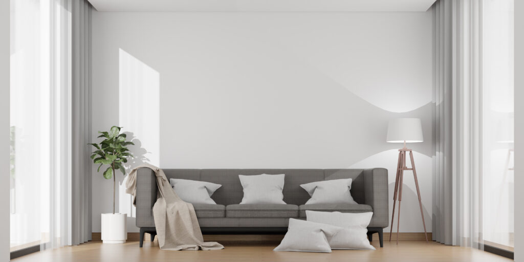
Light vs Dark grey tones
The depth of a grey paint color significantly impacts the feeling and perception of a living room.
- Light Grey Tones:
- Effect: Light greys (e.g., pale silver, dove grey, very light greige) reflect more light, making a living room feel brighter, more expansive, and airier. They can make a small room appear larger and more open.
- Mood: Create a fresh, crisp, calm, and contemporary atmosphere. They are excellent for minimalist or Scandinavian-inspired designs.
- Versatility: Act almost like a neutral white, providing a versatile backdrop that allows furniture and decor to be the stars of the show. They are easy to pair with almost any accent color.
- Best For: Smaller living rooms, rooms with limited natural light, or spaces where you want a bright, airy feel without the starkness of pure white.
- Dark Grey Tones:
- Effect: Dark greys (e.g., charcoal, slate, deep graphite) absorb light, creating a dramatic, intimate, and cozy atmosphere. They can make a large room feel more grounded and less cavernous.
- Mood: Evoke sophistication, elegance, and a touch of modern drama. They can make a space feel chic and enveloping.
- Versatility: While bold, dark greys can still be versatile. They provide a strong backdrop that allows bright or metallic accents to pop. They are particularly effective with rich textures.
- Best For: Larger living rooms, rooms with abundant natural light that can handle a darker shade, or spaces where you want to create a moody, luxurious, or impactful design statement. Often used on accent walls to add depth.
How lighting affects grey paint appearance
Grey is notoriously sensitive to light. The amount and type of natural and artificial lighting in your living room will dramatically influence how a grey paint color appears.
- Natural Light Direction:
- North-Facing Rooms: Receive cooler, bluer light throughout the day. Greys in these rooms will tend to look cooler, sometimes even picking up a slight blue or purple cast. A warm grey can help balance this coolness.
- South-Facing Rooms: Get abundant, warm, and bright light. Greys in these rooms will appear warmer and brighter. Cool greys can help temper intense warmth.
- East-Facing Rooms: Receive warm, bright light in the morning, which becomes cooler as the day progresses. The grey will shift throughout the day.
- West-Facing Rooms: Receive cool light in the morning and strong, warm light in the afternoon/evening. Greys will appear quite different depending on the time of day.
- Artificial Lighting (Light Bulbs):
- Warm White Bulbs (2700K-3000K): Incandescent or warm LED lights have a yellowish tint. They will bring out the warm undertones in greys (making greiges appear more beige) and can make cool greys appear less stark.
- Cool White/Daylight Bulbs (4000K+): Cooler LED or fluorescent lights have a bluer tint. They will enhance the cool undertones in greys (making cool greys appear more blue/green) and can make warm greys appear more neutral or even slightly cool.
- Neutral White (3500K): A more balanced light that aims to show true color.
- Surrounding Elements: The color of your flooring, large furniture, and even the view outside your windows can reflect onto the walls and subtly influence the perception of the grey paint’s undertones.
- Tip: Always test grey paint samples on your living room walls, observing them at different times of day and under various lighting conditions.
Top grey shades designers recommend
Designers often gravitate towards specific grey shades that offer versatility and timeless appeal, often due to their balanced undertones.
- Greige (Gray + Beige): The ultimate versatile neutral. Greiges blend the coolness of gray with the warmth of beige, making them incredibly adaptable to different lighting and decor styles. They avoid feeling too cold or too warm and are fantastic for creating a sophisticated, inviting backdrop.
- Dovetone Greys: These are often light to medium greys with subtle warmth, making them very livable and inviting without leaning too far into beige. They offer a refined elegance.
- Muted Charcoal/Slate: For a dramatic statement, deeper greys with soft, not stark, undertones. These create a moody, sophisticated atmosphere and pair beautifully with crisp whites, metallics, and rich textures.
- Light Blue-Greys: These greys have a noticeable cool, blue undertone, making them feel calm, airy, and refreshing. Ideal for coastal, minimalist, or serene living rooms.
- Warm Taupe-Greys: Greys with more pronounced brown or taupe undertones. They create a grounding, organic feel and pair wonderfully with natural wood tones and earthy palettes.
Matching grey walls with furniture & décor
Grey walls provide an excellent canvas for a wide range of furniture and decor styles. The key is to create contrast and harmony.
- Complementary Colors:
- Warm Wood Tones: Light or dark wood furniture (oak, walnut, teak) creates warmth and depth against both warm and cool greys.
- Whites & Creams: Crisp white trim, creamy sofas, or off-white textiles create beautiful contrast and brightness against grey walls, especially darker greys.
- Blues & Greens: These colors are naturally complementary to grey, creating serene or sophisticated palettes. Think navy, dusty blue, sage green, or emerald.
- Yellows & Oranges: Introduce pops of these warm colors through pillows, throws, or artwork to add vibrancy and energy to a grey room.
- Black: Used in furniture, frames, or accents, black provides a strong, modern contrast to grey.
- Textures: Layering textures is crucial for adding warmth and interest to a grey room. Incorporate plush velvets, chunky knits, soft linens, natural woven materials (rattan, jute), and metallic accents.
- Metallics:
- Warm Greys: Pair beautifully with gold, brass, or copper accents for a luxurious feel.
- Cool Greys: Look stunning with silver, chrome, or polished nickel for a modern, sleek aesthetic.
- Furniture Styles:
- Modern: Clean-lined furniture in whites, blacks, or bold colors pairs well with cool or charcoal greys.
- Traditional/Transitional: Classic upholstered pieces in creams, beiges, or rich fabrics complement warmer greys or greiges.
- Industrial/Urban: Exposed metal, distressed wood, and leather furniture can enhance the raw appeal of dark greys.
- Artwork: Grey walls provide a neutral backdrop that makes colorful artwork pop. Consider large-scale abstract pieces, black and white photography, or vibrant landscapes.
Warm greys vs Cool greys: What’s the difference?
The subtle undertones of grey paint are what truly define its character and influence the mood of a room.
- Warm Greys:
- Undertones: Have hints of yellow, beige, brown, or red. When you look closely, you might see a touch of a creamy or earthy hue.
- Feel: Create a cozy, inviting, and comforting atmosphere. They counteract any feeling of coldness often associated with gray.
- Best For: Rooms that need to feel more intimate, or spaces with a lot of cool natural light (like north-facing rooms) where you want to add warmth. They pair beautifully with natural wood tones, creams, and earthy colors.
- Examples: Greiges are the quintessential warm greys. Other examples might be greys with taupe or mushroom undertones.
- Cool Greys:
- Undertones: Have hints of blue, green, or purple. They often appear crisp and clean.
- Feel: Create a serene, sophisticated, and expansive atmosphere. They tend to make a space feel modern, airy, and sometimes slightly formal.
- Best For: Rooms with abundant warm natural light (like south-facing rooms) where you want to temper the brightness, or for achieving a sleek, contemporary, or minimalist aesthetic. They pair well with cool whites, blues, greens, and chrome/silver metallics.
- Examples: Greys with clear blue or green undertones, light silver greys.
Tip: Always look at paint samples in your living room at different times of day. A grey can appear warm or cool depending on the lighting conditions, wall exposure, and even the surrounding decor.
Choosing the ideal grey for your living room is a nuanced decision, but the result is a sophisticated and adaptable space that truly reflects your style. Selio Silva Painting offers expert color consultation and precise application to help you achieve the perfect modern, versatile, and chic grey living room.