



Choosing an exterior paint color for your home is a significant decision that impacts curb appeal, perceived value, and how your house harmonizes with its surroundings. While bold colors can make a statement, neutral exterior house colors offer a timeless elegance that withstands trends, complements various architectural styles, and provides a versatile backdrop for landscaping and outdoor decor. Opting for a neutral ensures your home looks sophisticated and inviting for years to come.
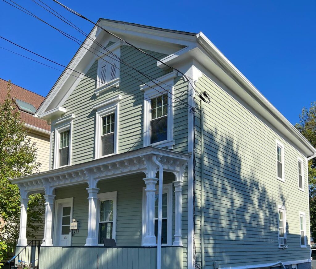
Popular exterior neutrals: Tan, greige, soft gray & cream
The spectrum of neutral exterior colors extends far beyond just white, offering a rich palette that provides depth and character without being overwhelming.
Tan:
- Description: A classic warm neutral, ranging from light sandy tones to deeper, earthy browns.
- Why it works: Tan creates a welcoming, grounded feel. It pairs beautifully with natural wood elements, stone accents, and lush green landscaping. It’s excellent for homes seeking a traditional or rustic aesthetic.
Greige:
- Description: A sophisticated blend of gray and beige, offering the best of both warm and cool worlds.
- Why it works: Greige is incredibly versatile, adapting well to different lighting conditions and architectural styles. It provides a modern yet inviting look, making it a popular choice for those who want a contemporary feel without committing to a stark gray.
Soft Gray:
- Description: Light to medium grays with subtle cool or warm undertones.
- Why it works: Soft grays offer a crisp, clean, and modern aesthetic. They work well with white trim, black accents, and can evoke a sense of calm and sophistication. Lighter grays can make a home appear larger and brighter.
Cream:
- Description: A warm, off-white with subtle yellow or beige undertones.
- Why it works: Cream provides a softer alternative to stark white, offering warmth and a classic, inviting charm. It pairs beautifully with brick, stone, and darker accent colors, creating a cozy and elegant facade.
How neutrals complement architectural features & landscape
One of the greatest strengths of neutral exterior colors is their ability to enhance and highlight the existing elements of your home and its natural surroundings.
- Highlighting Architectural Details:
- Neutrals provide a subtle backdrop that allows architectural features like intricate trim, columns, gables, unique window frames, or decorative stonework to stand out without competing for attention.
- They create clean lines that emphasize the structure and form of the house, whether it’s a traditional colonial, a modern farmhouse, or a craftsman bungalow.
- Harmonizing with Landscape:
- Neutral colors create a seamless transition between your home and its natural environment. They allow the vibrant greens of grass, trees, and shrubs, and the varied colors of flowers, to truly pop.
- Earthy neutrals like tan and greige blend beautifully with natural wood tones, stone pathways, and garden elements, creating a cohesive outdoor living space.
- Cool grays can provide a striking contrast to lush greenery, making the landscape feel more vivid.
- Integrating with Fixed Elements:
- Most homes have fixed exterior elements like brick, stone foundations, roofing materials, or concrete driveways. Neutrals are excellent at complementing these existing colors and textures, ensuring a harmonious overall palette.
- It’s easier to find a neutral paint color that works with existing brick or stone than it is to find a bold color that won’t clash.
- Versatility for Future Updates:
- A neutral base allows for easy changes to landscaping, outdoor furniture, or accent colors (like a front door) without needing to repaint the entire house. This flexibility ensures your home can evolve with your tastes or seasonal changes.
Why undertone choice (Warm vs. Cool) matters
The subtle undertones within a neutral color are critical, as they dictate how the paint will appear in different lighting conditions and how it will interact with other elements of your home’s exterior.
- Warm Undertones (Yellow, Red, Brown, Orange):
- Characteristics: Neutrals with warm undertones will feel cozier, more inviting, and can soften the overall look of your home. They absorb light more, giving a richer appearance.
- Examples: Beiges with yellow or pink hints, grays with brown (greige) or subtle red undertones, creamy whites.
- Best For: Homes with existing warm-toned materials like red brick, brown stone, or natural wood accents. They can also make a north-facing home feel warmer and more welcoming.
- Cool Undertones (Blue, Green, Purple):
- Characteristics: These neutrals will appear crisper, cleaner, and can make a space feel more expansive and modern. They reflect light more, giving a brighter appearance.
- Examples: Grays with blue or green hints, whites with cool undertones.
- Best For: Homes with existing cool-toned materials like gray stone, blue roofing, or black accents. They can also balance the intensity of strong afternoon sun on a west-facing home.
- Impact of Natural Light:
- North-Facing Homes: Receive cooler, indirect light. Warm neutrals can prevent the house from looking too stark or cold.
- South-Facing Homes: Receive abundant, warm light. Both warm and cool neutrals can work, but cool neutrals can help balance the intensity of the sun.
- East/West-Facing Homes: Experience different light at different times of day. Test samples throughout the day to see how the undertones shift.
- Testing is Key: Always test large paint samples on different sides of your home. Observe them at various times of day, under different weather conditions (sunny, cloudy), and against your existing roof, brick, stone, and trim. This is the only way to truly see how the undertones will play out.
Pairing neutrals with accent doors & trim
A neutral exterior provides the perfect canvas for introducing pops of color and defining architectural lines with accent doors and trim.
- Accent Doors:
- The Focal Point: The front door is often considered the “jewelry” of the home’s exterior. With a neutral house color, you have the freedom to choose almost any color for your front door to make a bold statement.
- Popular Choices:
- Vibrant Hues: Bright reds, deep blues, emerald greens, or sunny yellows can add personality and a welcoming touch.
- Classic Black: Creates a sophisticated and timeless contrast, especially with lighter neutrals like white, cream, or light gray.
- Natural Wood: A stained wood door adds warmth and a touch of organic beauty, complementing earthy neutrals.
- Consideration: The accent door color should still harmonize with the roof color and any existing brick or stone.
- Trim Colors:
- Crisp White: The most common and classic choice for trim. It provides a clean, sharp contrast against any neutral house color, highlighting architectural details and making windows pop.
- Off-White/Cream: For warmer neutrals (like tan or greige), a soft off-white or cream trim can create a softer, more blended look than stark white, avoiding harsh lines.
- Darker Neutrals: In some modern designs, a slightly darker shade of gray or even black trim can be used with a lighter neutral house color for a more dramatic, contemporary effect.
- Matching the House Color: For a truly monochromatic and minimalist look, the trim can be painted the same color as the house, but in a different sheen (e.g., semi-gloss trim on a flat house color) to add subtle definition.
- Window Frames: Often painted the same color as the trim, or in a complementary dark shade (like black or dark bronze) for a modern touch.
- Garage Doors: Generally, garage doors should blend with the house color to avoid drawing too much attention. Painting them the same neutral as the house, or a slightly darker shade, creates a cohesive look.
Selio Painting Silva’s expert approach to color selection
Choosing the perfect exterior paint color, especially a neutral that stands the test of time, requires more than just picking a shade from a swatch. At Selio Painting Silva, we employ an expert approach to ensure your home’s exterior is not only beautiful but also perfectly suited to its unique characteristics.
- Personalized Consultation: We begin with a detailed consultation to understand your vision, aesthetic preferences, and the overall style you want to achieve for your home.
- Architectural Harmony: Our experts assess your home’s architectural style, identifying key features, existing materials (brick, stone, roofing), and fixed elements that will influence color choices. We ensure the chosen neutral complements and enhances these features.
- Environmental Analysis: We consider your home’s exposure to natural light throughout the day, the surrounding landscape, and even the colors of neighboring homes. This helps us recommend neutrals with the correct undertones that will look their best in your specific environment.
- Large Sample Testing: We highly recommend and facilitate the application of large paint samples on different sections of your home’s exterior. This crucial step allows you to observe how the colors appear under various lighting conditions and against existing elements before making a final decision.
- Accent Color Guidance: We provide expert advice on pairing your chosen neutral with complementary accent colors for doors, trim, and other features, ensuring a cohesive and striking overall palette.
- Quality Application: Beyond color selection, our professional painters ensure meticulous preparation and flawless application, resulting in a durable and beautiful finish that truly stands the test of time.
With Selio Painting Silva, you’re not just getting a paint job; you’re getting a carefully curated exterior transformation that enhances your home’s curb appeal and reflects its unique character.
Ready to give your home a timeless and elegant exterior update? Selio Painting Silva specializes in expert exterior painting, guiding you through the entire process from color selection to a flawless finish. Contact us today for a free consultation and let’s bring your vision to life!